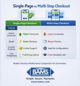
single-page vs multi-step checkout comparison for mobile showing differences in conversion rate, speed, transparency, and user experience

Mobile Checkout Optimization: Single-Page vs Multi-Step Checkout

Compare checkout approaches to reduce cart abandonment and boost mobile sales for your eCommerce store

Learn which checkout style converts better on mobile devices. This comparison breaks down conversion rates, implementation complexity, and security considerations to help you choose the right approach for your business.

TL;DR

  • Single-page checkout wins for mobile – Reduces friction, eliminates page load delays, and directly addresses the 85.65% mobile cart abandonment rate caused by difficult data entry.
  • Expect 20% to 35% conversion improvements – Sites implementing checkout optimizations including single-page flows see average conversion increases of 35% according to industry research.
  • Transparent pricing fits naturally – Single-page checkout displays subtotal, shipping, taxes, and final total together, eliminating the “surprise costs” that cause nearly half of all abandonment.
  • Choose multi-step only for complex products – If you sell configurable items or offer multiple shipping options, multi-step checkout’s guided approach may serve customers better.
  • Pair checkout improvements with fast payment processing – The best checkout experience means nothing if cash flow suffers from slow deposits or hidden processing fees.

The Mobile Checkout Decision: What You’re Really Choosing

Your mobile shoppers are abandoning carts at alarming rates. The checkout experience you choose directly impacts whether those visitors become customers or statistics.

single-page vs multi-step checkout comparison for mobile showing differences in conversion rate, speed, transparency, and user experience

A high-level comparison of single-page and multi-step checkout to help eCommerce businesses choose the best option for mobile conversions.

Modern payment experiences are shifting toward faster, frictionless checkout flows, with improvements in infrastructure reducing mobile friction and improving conversion outcomes according to Modern Treasury.

This comparison examines single-page checkout against traditional multi-step checkout specifically for mobile conversion. We’re focusing on what matters to eCommerce managers: conversion rates, implementation complexity, and how payment processing security and transparent pricing fit into each approach.

If you’re running an established online business with 10 to 50 employees and watching revenue leak through checkout friction, this analysis will help you make a confident decision.

Quick Verdict: Which Checkout Wins on Mobile?

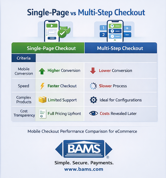
comparison table of single-page vs multi-step checkout showing mobile conversion rate, speed, complexity, security display, and implementation differences for eCommerce

A detailed comparison of single-page and multi-step checkout across key performance factors like conversion rate, speed, and implementation complexity.

Choose single-page checkout if your mobile traffic exceeds 50% of total visitors, your products don’t require extensive customization, and you want the fastest path to improved conversion rates.

Choose multi-step checkout if you sell complex products requiring configuration, your customers need detailed shipping options, or your current multi-step flow already converts above 3.5% on mobile.

For most eCommerce businesses struggling with mobile checkout optimization, single-page checkout delivers measurable improvements with less friction. Sites implementing checkout improvements (including single-page flows) see average conversion increases of 35%.

Criterion

Single-Page Checkout

Multi-Step Checkout

Winner

Mobile Conversion Rate

Higher (reduced friction)

Lower (more drop-off points)

Single-Page

Form Completion Speed

40-60% faster

Baseline

Single-Page

Complex Product Support

Limited

Strong

Multi-Step

Progress Visibility

All fields visible

Clear step indicators

Tie

Payment Security Display

Consolidated trust signals

Dedicated security step

Tie

Implementation Effort

Moderate

Lower (often default)

Multi-Step

A/B Testing Flexibility

Moderate

High (per-step testing)

Multi-Step

How We’re Evaluating These Checkout Approaches

Mobile Conversion Impact: The primary metric. Mobile conversion rates average 2.8% to 2.9% compared to desktop’s 2.9% to 4.8%. Any checkout approach must close this gap.

Friction Reduction: Every tap, scroll, and page load creates abandonment risk. We’re measuring how each approach minimizes user effort, especially for thumb-based navigation.

Payment Processing Security Visibility: Trust signals must appear at the right moment. Poor placement kills conversions regardless of checkout structure.

Transparent Pricing Display: Hidden fees cause 48% of cart abandonment. How each approach handles cost transparency matters significantly. Optimized payment flows improve authorization rates and reduce checkout friction through tokenization and secure authentication, as outlined by Visa.

Implementation and Maintenance: Your team’s bandwidth is limited. We’re considering setup complexity, ongoing optimization needs, and integration with your existing payment gateway solutions.

Scalability: Will this approach still work as your catalog grows and mobile traffic increases?

Head-to-Head: Mobile Conversion Rate Performance

Single-Page Checkout Assessment

Single-page checkout consolidates shipping, billing, and payment into one scrollable view. On mobile, this eliminates page load delays between steps, a major friction source on cellular connections.

With all fields visible, customers see exactly what’s required upfront. No surprises, no wondering how many more steps remain.

Single-page flows enable “one-thumb checkout” design, where users can complete purchases without repositioning their grip. This matters more than most eCommerce managers realize.

Strong security standards are essential for protecting payment data and maintaining trust during checkout, as defined by the PCI Security Standards Council.

Multi-Step Checkout Assessment

Multi-step checkout breaks the process into distinct phases: shipping, then billing, then payment, then confirmation. Each step loads separately, creating multiple potential exit points.

On mobile, each page transition adds 2 to 4 seconds of perceived wait time.

However, multi-step checkout excels at guiding customers through complex decisions. If you’re selling configurable products or offering multiple shipping tiers, the structured approach prevents overwhelm.

Verdict: Single-Page Wins for Standard eCommerce

For businesses selling straightforward products with standard shipping options, single-page checkout reduces mobile friction meaningfully. The exception: if your products require extensive customization or your checkout already converts above industry benchmarks, the switching cost may not justify the gain.

Head-to-Head: Payment Security and Trust Display

Single-Page Checkout Assessment

Single-page checkout allows you to display payment processing security badges, SSL indicators, and trust signals alongside the payment fields themselves. Customers see security reassurance exactly when entering sensitive data.

The consolidated view also makes transparent pricing easier to maintain. Customers see subtotal, shipping, taxes, and final total without clicking through multiple screens. No hidden fees appearing at the last moment.

Integration with Apple Pay and Google Pay works particularly well in single-page flows, enabling customers to skip form completion entirely.

Multi-Step Checkout Assessment

Multi-step checkout can dedicate an entire screen to payment and security, creating a focused “secure payment” experience. Some customers find this reassuring, as the distinct step signals “now we’re handling your payment carefully.”

However, cost transparency suffers. Shipping costs often appear on step two, taxes on step three, and the final total only on step four. This fragmented reveal triggers the “unexpected costs” abandonment that plagues eCommerce.

Verdict: Single-Page Wins for Transparency

Single-page checkout’s consolidated view naturally supports transparent pricing. Customers never feel ambushed by costs. For payment processing security perception, both approaches can work, but single-page requires more intentional trust signal placement.

Head-to-Head: Mobile-Specific Optimization

Single-Page Checkout Assessment

Single-page checkout performs best when powered by an integrated payment gateway that supports digital wallets, tokenization, and fast authorization. This allows customers to complete purchases with fewer steps, especially on mobile where speed and simplicity directly impact conversion.

Single-page checkout maximizes these integrations by presenting digital wallet options prominently within the unified flow.

The approach also supports Apple Pay integration on platforms like BigCommerce, reducing checkout to a single biometric confirmation.

Multi-Step Checkout Assessment

Multi-step checkout can be optimized for mobile, but requires more effort. Each step needs independent mobile optimization: appropriate tap targets, minimal scrolling, and fast load times.

Progress indicators help, but they also remind customers how much work remains. On mobile, where patience runs shorter, this visibility can backfire.

Verdict: Single-Page Wins for Mobile-First Design

If mobile traffic represents your growth opportunity (and it likely does), single-page checkout provides a more natural foundation for mobile checkout optimization. Multi-step can be optimized, but you’re working against the format’s inherent friction.

Use Case Mapping: Which Checkout Fits Your Business?

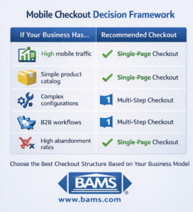
If you sell standard products with flat-rate shipping, choose single-page checkout. Your customers don’t need step-by-step guidance, and they’ll appreciate the speed. Expect conversion improvements in the 20% to 35% range.

If you sell subscription products or memberships, choose single-page checkout. The simplified flow reduces friction for recurring purchase decisions, and transparent pricing builds long-term trust.

If you sell configurable products with multiple options, consider multi-step checkout. A dedicated configuration step prevents the single-page from becoming overwhelming. However, test a well-designed single-page variant before assuming multi-step is necessary.

If you offer complex shipping options (multiple carriers, delivery windows, in-store pickup), multi-step checkout handles this better. A dedicated shipping step lets customers make informed decisions without cluttering the payment experience.

If you’re experiencing high mobile abandonment specifically, start with single-page checkout. The format directly addresses the friction causing most mobile exits. You can always add complexity later if needed.

What Both Approaches Get Wrong

Neither checkout format solves slow payment processing or delayed funding. A beautiful checkout experience means nothing if customers wait days for order confirmation or if your cash flow suffers from slow deposits.

Both approaches also struggle with cart abandonment recovery after the fact. The checkout format affects initial conversion, but re-engaging abandoners requires email sequences, retargeting, and cart-saving functionality that exist outside the checkout itself.

Finally, neither format automatically handles chargeback management. Payment processing security at checkout prevents fraud, but disputed transactions require proactive defense systems regardless of how customers originally checked out.

Migration and Switching Considerations

Switching from multi-step to single-page typically requires 2 to 4 weeks of development time, depending on your platform. Most modern eCommerce platforms (Shopify, BigCommerce, WooCommerce) offer single-page checkout apps or native options.

Data migration is minimal. Customer accounts, saved addresses, and payment methods transfer regardless of checkout format. Your payment gateway integration remains unchanged.

The real cost is testing. Plan for 4 to 8 weeks of A/B testing to validate improvements before fully committing. Don’t switch based on industry averages alone. Your specific audience may respond differently.

When switching makes sense: If your mobile conversion rate sits below 2.5% and mobile traffic exceeds 40% of total visitors, the potential upside justifies the implementation investment. If you’re already converting above 3.5% on mobile, focus on other optimization levers first.

Final Recommendation

Single-page checkout wins for most eCommerce businesses prioritizing mobile checkout optimization. The format reduces friction where it matters most, supports transparent interchange plus pricing naturally, and integrates cleanly with modern payment processing security features like digital wallets.

Choose multi-step checkout only if your products genuinely require guided configuration or your current mobile conversion already exceeds industry benchmarks.

Whatever checkout format you choose, pair it with payment processing that matches your speed expectations. Next-day funding, transparent interchange-plus pricing, and proactive chargeback defense turn checkout improvements into actual cash flow improvements. The checkout gets customers to click “buy.” Your payment partner determines how quickly that translates to money in your account.

Frequently Asked Questions

What is checkout optimization and why is it important?

Checkout optimization means reducing friction between “add to cart” and “purchase complete.” It matters because small improvements create significant revenue gains. Sites implementing checkout improvements see average conversion increases of 35%, according to recent eCommerce research. For a business processing $500,000 annually, that’s $175,000 in recovered revenue.

How can I reduce cart abandonment during the checkout process?

Focus on three areas: eliminate surprise costs by showing total pricing upfront, reduce form fields to only essential information, and offer guest checkout options. Single-page checkout addresses all three by consolidating the experience and displaying transparent pricing throughout. Adding digital wallet options like Apple Pay can reduce abandonment further by eliminating typing entirely.

Does single-page checkout work for all product types?

Single-page checkout works best for standard products with straightforward shipping. If you sell highly configurable items (custom furniture, personalized products) or offer complex shipping options, multi-step checkout may serve customers better. Test both formats with your specific audience before committing.

How does payment processing security affect checkout conversion?

Trust signals at checkout directly impact conversion. Customers need to see SSL certificates, security badges, and familiar payment logos when entering card information. Single-page checkout allows you to display these signals alongside payment fields. Multi-step checkout can dedicate a full screen to security, but the fragmented experience may reduce overall trust.

Which payment methods should I offer to optimize my checkout experience?

At minimum, offer major credit cards, PayPal, and at least one digital wallet (Apple Pay or Google Pay). iOS users convert 15% to 20% higher than Android users, largely due to Apple Pay’s one-click experience. The more payment options you offer, the fewer customers you lose to payment preference friction.

How long does it take to implement single-page checkout?

Most implementations take 2 to 4 weeks depending on your platform and customization needs. Modern platforms like Shopify and BigCommerce offer native single-page options or apps that reduce implementation time. Plan an additional 4 to 8 weeks for A/B testing to validate improvements before full rollout.

Sources

  1. Modern Treasury
  2. Visa
  3. PCI Security Standards Council