How Transparent Checkout Pricing Boosts Conversions
Why hidden fees kill sales and how clear pricing recovers lost revenue at checkout
Learn why unexpected costs drive 70% cart abandonment and how transparent pricing rebuilds trust. Get actionable steps to optimize your checkout experience and recover lost sales.
TL;DR
- Hidden fees cause most cart abandonment – With 70% of carts abandoned and $260 billion recoverable through better checkout design, transparent pricing is your biggest conversion opportunity.
- Show costs before checkout begins – Display shipping estimates on product pages, show tax calculations in the cart, and let customers know their total before they click “checkout.”
- Explain every line item clearly – Vague labels like “service fee” trigger suspicion. Specific descriptions like “expedited handling” feel legitimate and build trust.
- Simplify your pricing structure – Consolidate fees where possible, consider absorbing small charges, and aim for five or fewer line items in your order summary.
- Test and measure each change – Track abandonment by checkout step, A/B test significant changes, and attribute conversion improvements to specific transparency efforts.
What This Guide Covers
This guide shows you how transparent pricing at checkout directly improves your conversion rates. You’ll learn why hidden fees kill sales, how to structure pricing that builds trust, and what specific changes recover lost revenue.
We’re writing for eCommerce managers at established businesses who already have traffic but lose too many sales at the final step. By the end, you’ll understand exactly how pricing transparency connects to conversion rate improvement and have a clear action plan.
This guide focuses on the pricing and cost communication aspects of checkout optimization. We won’t cover product page design, traffic acquisition, or post-purchase flows.
Why Transparent Pricing Matters Now
![]()
Combining transparent pricing with customer behavior tracking reduces friction, builds trust, and significantly improves mobile checkout conversion rates.
Transparent pricing builds trust, reduces friction, and significantly increases checkout conversion rates compared to hidden or unexpected fees.
Unexpected costs remain the top reason shoppers abandon carts. According to Visa, streamlined and transparent checkout experiences significantly improve transaction completion rates.
When fees appear late in checkout, customers feel deceived. They leave, and many never return.
Your competitors are catching on. The businesses that fix their eCommerce checkout experience first capture customers that others lose.
The cost of inaction compounds. Every abandoned cart represents not just a lost sale but potential negative word-of-mouth and wasted acquisition spend. You paid to bring that customer to your site. Losing them at checkout wastes that investment.
Core Concepts You Need to Understand
What “Transparent Pricing” Actually Means
Transparent pricing means customers can predict their total cost before they reach the final checkout step. This includes product price, shipping, taxes, and any fees. No surprises.
This differs from “low pricing” or “competitive pricing.” You don’t need the cheapest prices. You need predictable prices. Customers accept reasonable costs when they see them upfront. They reject the same costs when they feel ambushed.
The Trust-Conversion Connection
Trust signals in checkout work because purchasing requires vulnerability. Customers share payment information and trust you to deliver. Any hint of deception triggers protective instincts. They close the tab.
The PCI Security Standards Council emphasizes that clear and secure payment practices build customer trust and reduce checkout friction.
Transparent pricing functions as a trust signal. It tells customers: “We respect you enough to be honest about costs.” This psychological safety enables purchase completion.
Friction vs. Abandonment
Every checkout step creates friction. Some friction serves a purpose (confirming shipping address prevents errors). Hidden fees create friction without value. They only benefit the seller’s short-term appearance of lower prices.
Streamlining to 3 steps reduces abandonment. But step count matters less than friction quality. Three transparent steps outperform five steps with hidden costs.
The Transparent Pricing Framework
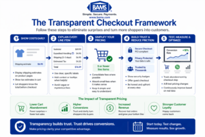
A structured approach to transparent checkout pricing helps reduce cart abandonment and consistently improve conversion rates.
This framework has four connected stages: Reveal, Explain, Simplify, and Reinforce. Each stage builds on the previous one.
According to the Federal Reserve, payment cost structures influence how merchants present pricing, making transparency critical for maintaining trust and improving conversions.
Reveal addresses when and where you show costs. Explain covers how you justify those costs. Simplify focuses on reducing the cognitive load of understanding your pricing. Reinforce ensures consistency across the entire checkout experience.
These stages work as a cycle. After implementing all four, you measure results and refine each stage based on data. The framework applies whether you sell physical products, digital goods, or services.
Step-by-Step Implementation
Step 1: Audit Your Current Checkout for Hidden Costs
Objective: Identify every point where customers encounter unexpected costs.
Walk through your checkout as a customer. Document every screen. Note when each cost element appears: base price, shipping, taxes, handling fees, service charges, payment processing fees passed to customers.
Create a timeline showing when customers first see each cost. If shipping appears on page three of checkout, that’s a hidden cost, even if you display it before final purchase. Customers formed price expectations earlier.
Check your mobile experience separately. Mobile checkout optimization requires extra attention because smaller screens hide information more easily.
What to avoid: Don’t assume you know your checkout flow. Test it fresh. Don’t skip mobile testing. Don’t ignore small fees (they accumulate psychologically).
Success indicators: You have a complete list of every cost element and exactly when it appears in the customer journey. You’ve identified at least two or three costs that appear “late” in the process.
Step 2: Move Cost Disclosure Earlier
Objective: Ensure customers know their approximate total before entering checkout.
Display shipping costs (or shipping thresholds) on product pages. Add a shipping calculator to the cart page. Show estimated taxes before the checkout button. Consider displaying “Order total: approximately $X” in the cart summary.
For complex shipping (weight-based, location-based), provide ranges: “Shipping: $5-12 depending on location.” Ranges feel honest. Hidden costs feel deceptive.
If you offer free shipping above a threshold, display progress toward that threshold prominently. “Add $15 more for free shipping” motivates additional purchases and sets clear expectations.
This approach supports efforts to prevent shopping cart abandonment by eliminating the primary cause: surprise costs.
What to avoid: Don’t hide behind “calculated at checkout” when you could provide estimates. Don’t require account creation to see shipping costs. Don’t show artificially low estimates that increase later.
Success indicators: Customers can estimate their total cost within 10% accuracy before clicking “checkout.” Your product pages or cart page show shipping information.
Step 3: Explain Every Line Item
Objective: Help customers understand what they’re paying for and why.
Each line item in your order summary needs context. “Shipping: $8.99” becomes “Standard Shipping (3-5 business days): $8.99.” “Tax: $4.50” becomes “Sales Tax (CA 7.25%): $4.50.”
For fees that might seem arbitrary, add brief explanations. Handling fees, oversized item surcharges, and expedited processing all benefit from one-line justifications.
Use tooltips or expandable sections for customers who want more detail. Some shoppers want to know exactly how you calculated shipping. Give them access without cluttering the main view.
This level of hidden fees transparency builds trust. Customers who understand costs accept them more readily than customers who feel confused.
What to avoid: Don’t use vague labels like “Service Fee” or “Processing.” Don’t bury explanations in separate pages. Don’t assume customers understand industry-standard terminology.
Success indicators: Every line item in your checkout has a clear label that a new customer would understand. Optional expanded explanations exist for complex charges.
Step 4: Simplify Your Pricing Structure
Objective: Reduce the number of separate charges customers must process.
Review your fee structure. Can you consolidate? “Shipping + Handling” as one line feels simpler than two separate charges. Consider building small fees into product prices rather than listing them separately.
Evaluate whether you should absorb certain costs. A $2 “packaging fee” might cost you more in abandoned carts than the revenue it generates. Test removing small fees and measure the conversion impact.
Consider flat-rate shipping if your products allow it. “$7 flat shipping” requires less mental processing than “$4.99 base + $1.50 per item + weight surcharge.”
What to avoid: Don’t create artificially complex pricing to make products seem cheaper. Don’t add fees to offset free shipping thresholds. Don’t change pricing structure without testing.
Success indicators: Your checkout shows five or fewer line items for a typical order. Customers can calculate their approximate total mentally.
Step 5: Implement Real-Time Total Updates
Objective: Keep customers informed as their order changes.
Your checkout should update totals instantly when customers change quantity, select shipping options, or apply coupons. Delays create uncertainty. Uncertainty creates abandonment.
This applies to checkout interactions too. Sluggish total updates feel broken.
Show running totals throughout the checkout process, not just at the end. If your checkout has multiple pages, display the current total on every page. Single-page checkout designs handle this naturally.
Consider implementing a guest checkout option that maintains real-time updates without requiring account creation. Forced registration adds friction and delays the total confirmation customers need.
What to avoid: Don’t show “calculating…” for more than one second. Don’t require page refreshes to update totals. Don’t hide totals behind expandable sections.
Success indicators: Totals update within 500 milliseconds of any change. The current total is visible at all times during checkout.
Step 6: Offer Multiple Payment Options with Clear Terms
Objective: Give customers payment choices without adding confusion.
Payment method variety improves conversion, but each option needs clear presentation. Display accepted payment methods early. Show any payment-specific fees or discounts upfront.
If you offer buy-now-pay-later options, display the installment breakdown clearly. “4 payments of $25” helps customers understand the commitment. Hide nothing about interest or fees.
Your payment processing security should be visible but not overwhelming. Trust badges, SSL indicators, and PCI compliance mentions reassure customers without cluttering the interface.
Consider whether your current payment gateway solutions serve your conversion goals. Some payment processors offer better checkout experiences than others, with faster processing and fewer declined transactions.
What to avoid: Don’t surprise customers with payment method surcharges at the final step. Don’t hide payment options behind extra clicks. Don’t show options you can’t actually process.
Success indicators: All payment options are visible before customers enter payment details. Any payment-specific terms appear alongside the option, not after selection.
Step 7: Test, Measure, and Refine
Objective: Validate that your changes improve conversion and identify further opportunities.
Implement checkout process analysis before and after changes. Track abandonment rate by checkout step. Identify where customers now drop off versus where they dropped off before.
A/B test significant changes when possible. Test one variable at a time: shipping display location, fee consolidation, real-time updates. Measure conversion rate improvement for each change.
Use customer behavior tracking to understand how people interact with your new pricing displays. Do they hover over tooltips? Do they change shipping options more frequently? These behaviors indicate engagement with your transparency efforts.
Review your payment processing costs alongside conversion improvements. Reducing credit card processing fees gives you more margin to absorb customer-facing fees, further simplifying your pricing.
What to avoid: Don’t test multiple changes simultaneously. Don’t declare success after one week. Don’t ignore mobile-specific metrics.
Success indicators: You have baseline metrics and post-change metrics for each implementation. You can attribute conversion changes to specific transparency improvements.
Common Mistakes That Undermine Transparency
Showing low prices, then adding fees: This feels like bait-and-switch. Customers remember the first price they saw. Everything added later feels like a penalty.
Using vague language: “Service fee” and “processing charge” raise suspicions. Specific language (“expedited handling” or “oversized shipping surcharge”) feels legitimate.
Hiding behind industry norms: “Everyone charges this fee” doesn’t matter to customers. They’re comparing their expectation to their experience, not to your competitors.
Over-explaining: Transparency doesn’t mean overwhelming detail. A tooltip with three sentences beats a paragraph nobody reads.
Inconsistent pricing across channels: If your mobile site shows different fees than desktop, customers notice. Consistency builds trust.
What to Do Next
Start with Step 1: audit your current checkout. Document every cost and when it appears. This exercise alone often reveals obvious improvements.
Pick one change to implement this week. Moving shipping estimates to your cart page typically offers the best effort-to-impact ratio. Test it for two weeks, then measure.
Return to this guide as you progress through each step. Transparent pricing isn’t a one-time project. It’s an ongoing commitment to respecting your customers’ need for clarity.
Your checkout experience shapes how customers feel about your entire brand. Make it honest, and they’ll trust you with their business.
Frequently Asked Questions
What is checkout optimization and why is it important?
Checkout optimization means improving every element of your purchase process to help more customers complete their orders. It matters because small improvements create significant revenue gains. With average cart abandonment at 70%, even modest conversion rate improvement translates to substantial recovered sales.
How can I reduce cart abandonment during the checkout process?
The most effective approach is eliminating surprise costs. Show shipping, taxes, and fees before customers reach checkout. Offer guest checkout options, multiple payment methods, and real-time total updates. Keep the process to three steps or fewer when possible.
When should I consider implementing a single-page checkout solution?
Consider single-page checkout when your analytics show high drop-off between checkout steps, when you sell simple products with few customization options, or when mobile users represent a large portion of your traffic. Test it against your current flow before full implementation.
Which payment methods should I offer to optimize my checkout experience?
At minimum, offer major credit cards, PayPal or similar digital wallets, and at least one buy-now-pay-later option. The specific mix depends on your customer demographics. Review your analytics to see which methods your customers prefer, then ensure those options are prominent and clearly presented.
How can I build trust with customers during the checkout process?
Display security badges and SSL indicators without overwhelming the page. Show clear return policies and customer service contact information. Most importantly, be transparent about all costs from the start. Customers trust businesses that don’t hide fees or surprise them with charges.
How does transparent pricing affect my profit margins?
Transparent pricing typically improves margins despite potentially absorbing some fees. The conversion rate improvement from reduced abandonment usually outweighs the cost of fee absorption. Test specific changes with your actual numbers, but most businesses find transparency pays for itself through increased completed orders.
Sources


